Wingdings History: When Was Wingdings Created?
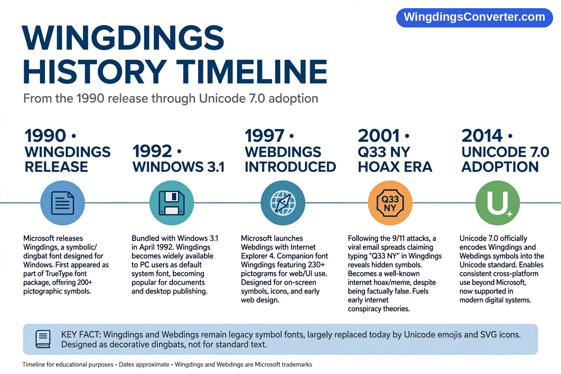
Here’s a question with a short answer and a long, strange story behind it: when was Wingdings created? It was created at the end of the 1980s, released by Microsoft in 1990, and it reached most of the world with Windows 3.1 in 1992, when it suddenly sat on millions of keyboards disguised as a font. Within a few years, that humble picture font had sparked an urban legend, a famous hoax, and a decoding hobby that still keeps converters busy today.
This is the storytelling version of Wingdings history — designers first, then the software, then the rumours, and finally the unlikely second act in which Unicode adopted Wingdings’ own pictures as real characters.
Before Wingdings: The Drawings That Started It All
Wingdings didn’t begin at Microsoft. Its glyphs have roots in work by type designers Charles Bigelow and Kris Holmes, the duo behind the Lucida family of typefaces. Working at Type Solutions, Bigelow and Holmes had drawn collections of icons, arrows, and stars to accompany the Lucida fonts — the kinds of small, useful pictures that documents always seem to need: pointing hands, simple shapes, everyday objects.
Microsoft licensed that artwork. In an era when most computer users had no clip-art library, no emoji keyboard, and no easy way to put any picture at all into a document, the idea was practical rather than playful: acquire a ready-made set of icons, put them in a font, and let anyone insert a picture by typing a letter and changing the font. The famous faces show the same logic at its simplest — in Wingdings, J is a smiling face, K is a neutral face, and L is a sad face, an arrangement so memorable that versions of it survive in email culture to this day.
1990–1992: Release, Then Arrival on Every Desk
Microsoft released Wingdings in 1990. Two years later, Windows 3.1 (1992) carried it into offices and homes at a scale no typeface had ever enjoyed. That distinction matters: plenty of people will tell you Wingdings “came with Windows 3.1,” and for most users that’s when it truly arrived, even though the font itself was already two years old.
Timing was everything. Windows 3.1-era PCs could finally print decent-looking documents, and owners of those documents wanted more than plain text. Wingdings offered instant decoration: a phone beside a contact number, a check mark (the famous trick — type ü in Wingdings and it draws as a ✓) beside a completed item, an envelope beside an address. Alongside its dingbat predecessor Zapf Dingbats, which professionals had used since 1978, Wingdings made picture fonts a mass phenomenon.
Wingdings 2 and Wingdings 3 followed later, in the Office era, adding more specialised glyphs — extra numbers, shapes, and a heavy focus on arrows in the third font. Most casual users never noticed the sequels; the original had already become the Wingdings in the public mind.
The NYC Sequence: How an Urban Legend Was Born
Every long-lived font collects folklore, but Wingdings collected more than most. In the 1990s, users playing with the font — decoding it was already a pastime — noticed what happened when you typed NYC in Wingdings:
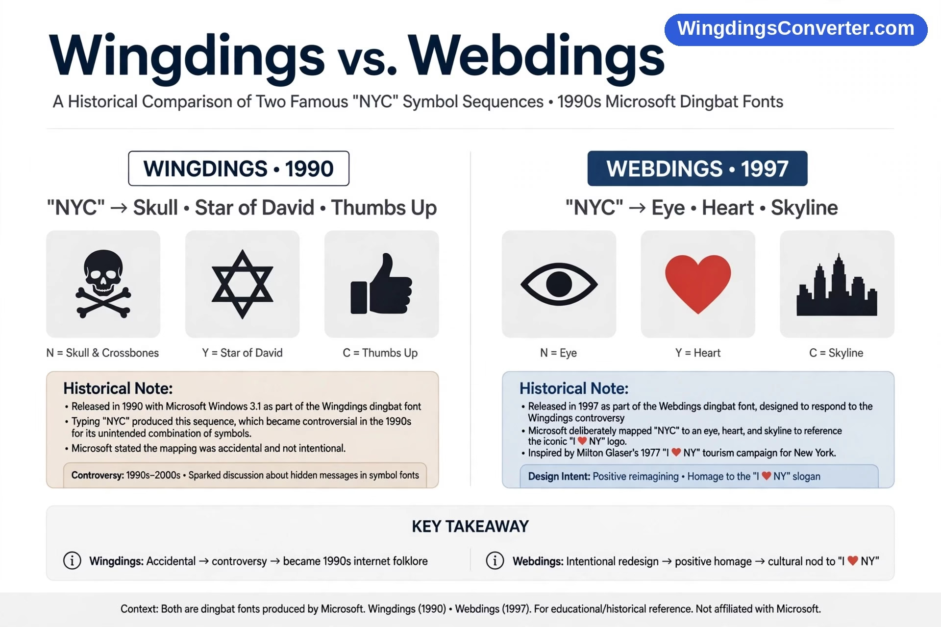
- N appeared as a skull and crossbones
- Y appeared as a Star of David
- C appeared as a thumbs up
Put together, that sequence could be read as a deeply offensive message about New York and Jewish people, and the rumour spread the way 1990s rumours did: by word of mouth, chain email, and eventually newspaper coverage. It became one of the earliest viral “hidden message in software” stories.
The facts were less sinister. The glyphs were simply the standard pictures assigned to those character slots in a large icon set — a skull for N, a star for Y, a hand for C — and readers were assembling meanings the designers hadn’t placed there. Microsoft stated the rendering was coincidental, not an intended message. Bigelow himself addressed the controversy publicly, explaining that the symbols were drawn as generic icons and the combination was an accident of the mapping. The episode became a case study in how pattern-hungry humans are: give people 200-odd pictures on keys, and someone will find a sentence in them.
There’s a graceful footnote. When Webdings arrived in 1997 (shipped with Internet Explorer 4), typing NYC in it produced something entirely different: an eye, a heart, and a city skyline — “I ♥ NY.” That was no accident; it was a deliberate, playful design choice, widely understood as the designers answering the legend with the city’s famous slogan. Where Wingdings sparked the rumour, Webdings winked at it. The comparison between the two fonts is covered properly in Wingdings vs. Webdings.
The Q33 NY Hoax: Wingdings After 9/11
A darker piece of folklore followed the September 11 attacks. A chain message claimed that typing “Q33 NY” — supposedly the flight number of one of the hijacked planes — into Word and changing it to Wingdings would reveal images of a plane, two tower-like buildings, and a skull. Screenshots flew around the early-2000s internet.
It was a hoax, on every level that mattered. No flight with the number Q33 NY existed — the flights involved that day had entirely different numbers, and Q33 wasn’t a flight designator in that story at all. The string was reverse-engineered: someone had looked for a combination of characters that produced alarming pictures in Wingdings, then invented a “flight number” to fit it. Any long picture font can be mined this way, which is why the trick proves nothing — but it demonstrated, again, how quickly symbol fonts attract conspiracy thinking, and fact-checkers spent years debunking it. It’s worth stating plainly here, because the claim still circulates: Q33 NY was made up.
The Quiet Decades: A Font Everyone Had and Rarely Named
Through the 2000s, Wingdings settled into a double life. In offices, it was infrastructure — the check marks in a thousand shared forms depended on it, which is why old documents still break so characteristically when the font goes missing, a problem explored in why Wingdings symbols are missing. Online, it was a toy and a puzzle: forums traded messages “written in Wingdings,” fans hid jokes in it, and the first converter tools appeared to translate it back — ancestors of the Wingdings converter this site is built around.
Microsoft’s own documentation and reference pages kept the official mapping available, and Wikipedia’s Wingdings article became the standard public record of the font’s origins, controversies, and glyph set — a fair sign of how thoroughly a bundled font had entered general culture.
2014: Unicode Adopts the Pictures
The most fitting chapter in Wingdings history is the one that secured its legacy. In 2014, Unicode 7.0 added a large set of Wingdings and Webdings glyphs to Unicode itself — as real characters, with their own code points, in blocks including Miscellaneous Symbols and Pictographs and the ornamental dingbat ranges. Microsoft was involved in bringing the glyphs into the standard.
Why does that matter? Because it solved the original dingbat problem for those pictures. A Wingdings star or arrow no longer had to be “a letter in a font you might not have.” As a Unicode character, it was itself — storable, searchable, and displayable on any modern system. The pictures Bigelow and Holmes drew in the Lucida era had travelled from licensed artwork, to a Windows font, to permanent citizens of the universal character set. Few design assets have ever completed that journey.
Wingdings Today
Wingdings still ships with Windows and Office, still decodable, still occasionally discovered by a new generation who change a font by accident and go looking for answers — often landing on guides like how to translate Wingdings symbols or the download and background pages at wingdings font download. Emoji took over its casual picture duties, and Unicode symbols took over its serious ones. What remains uniquely Wingdings is the history: a practical 1990 solution to “documents need pictures” that accidentally became a legend machine.
Why Wingdings Lasted When Other Fonts Didn’t
Plenty of novelty fonts shipped in the 1990s and vanished without a trace. Wingdings survived because it sat at the intersection of three forces. First, distribution: being bundled with Windows meant it was never something you chose — it was simply there, on every machine, for decades. Second, utility: offices quietly built real documents on its check marks, arrows, and symbols, so removing it would have broken real work. Third, mystery: the legends gave people a reason to open it on purpose, to experiment, to decode. A font people play with is a font people remember. That combination — installed everywhere, used for real tasks, and surrounded by stories — is almost impossible to manufacture deliberately, which is why Wingdings remains a reference point more than thirty years after its release, long after its practical job passed to emoji and Unicode.
Frequently Asked Questions
When exactly was Wingdings created and released?
Wingdings was created by Charles Bigelow and Kris Holmes at Type Solutions, from icon artwork rooted in their Lucida work, and released by Microsoft in 1990. For most users it arrived with Windows 3.1 in 1992, which bundled the font and put it on millions of computers.
Who designed Wingdings?
Charles Bigelow and Kris Holmes. The glyphs grew out of icons, arrows, and stars the pair had drawn for the Lucida typeface family before Microsoft licensed the material and turned it into a standalone picture font.
Is the NYC story true — did Wingdings hide an offensive message?
No hidden message was intended. Typing NYC in Wingdings genuinely produces a skull and crossbones, a Star of David, and a thumbs up, because those were the glyphs on the N, Y, and C keys — but Microsoft stated the combination was coincidental. In Webdings, NYC was deliberately set to eye / heart / skyline, “I ♥ NY,” as a playful response.
Was Q33 NY a real flight number?
No. The post-9/11 chain message claiming Q33 NY was a hijacked flight number, and that it produced plane and tower imagery in Wingdings, was a hoax. No such flight number existed; the character string was chosen afterwards to fit the font’s pictures.
What are Wingdings 2 and 3?
Later companion fonts released in the Office era. Wingdings 2 added more document-oriented glyphs and Wingdings 3 is dominated by arrows and directional shapes. Neither displaced the original, which remains the version everyone means by “Wingdings.”
Is Wingdings still available today?
Yes. It still ships with Windows and Microsoft Office, and in 2014 many of its glyphs were also added to Unicode 7.0 as real characters. So even where the font itself fades from daily use, its pictures survive permanently in the standard every device uses.
Conclusion
When was Wingdings created? In 1990, by two type designers solving a practical problem — but its history didn’t stop at release. Windows 3.1 made it universal, the NYC sequence made it infamous, a hoax made it a fact-checking staple, Webdings answered it with a joke, and Unicode eventually adopted its pictures outright. Not bad for a font most people only ever opened by accident.