How to Use Wingdings in PowerPoint
Slides punish clutter and reward clarity, which is exactly why symbols earn their place in them. A single well-chosen check mark can replace a sentence. An arrow can carry an audience’s eye across a busy diagram faster than any animation. That’s the real promise of learning how to use Wingdings in PowerPoint: not decorating slides until they sparkle, but using compact, familiar symbols as visual shorthand — icons before we called everything an icon. PowerPoint, as part of Microsoft Office, includes Wingdings in its font list, so everything you need is already installed. The skill is in how you insert symbols, size them, colour them, and — just as much — how you restrain yourself from using three symbols where one would do.
This guide is written for people making real decks: status updates, training slides, checklists, process diagrams, classroom presentations. We’ll cover the two ways to get Wingdings symbols onto a slide, how to treat them like design elements (because on a slide, that’s what they are), what to watch for when you present on someone else’s laptop, and how PowerPoint’s Wingdings compares with simply pasting in Unicode symbols or pictures.

The basics: Wingdings is already in PowerPoint
Wingdings was released by Microsoft in 1990, designed by Charles Bigelow and Kris Holmes of Type Solutions, and it ships with Microsoft Office — including PowerPoint on Windows, and PowerPoint for Mac when Office for Mac is installed. There’s nothing to download and nothing to enable. If PowerPoint is on your machine, Wingdings is in its font menu.
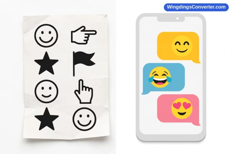
The fastest sanity check takes ten seconds. Open a blank slide, add a text box, type a capital J, select it, and set its font to Wingdings. It should become a smiling face. K in Wingdings is a neutral face, L is a sad face — those three are the classic test characters. If they render correctly, every Wingdings workflow in this article is available to you.
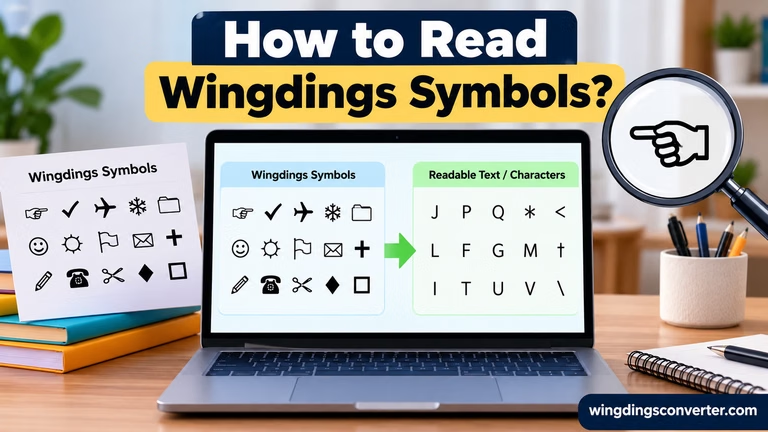
Remember what Wingdings actually is, because it explains every behaviour you’ll meet later: it’s ordinary characters displayed as pictures by the font. The letter hasn’t changed; its costume has. Keep that in mind when we talk about presenting on other computers and exporting PDFs, because costumes only work when the wardrobe — the font — is present.
Method 1: Type the character, then apply the Wingdings font
For symbols you use repeatedly, typing is far faster than browsing a symbol gallery every time.
- Click into a text box (or insert one with Insert > Text Box) and type the character whose symbol you want, in an ordinary font first if you like — you’ll see the plain letter, which is actually helpful confirmation of what you’ve typed.
- Select just that character (or the whole line, if the whole line should be symbols).
- Open the font dropdown on the Home tab, type “Wingdings,” and press Enter.
- Adjust size and colour with the normal text tools. On slides, you’ll usually go much bigger than body text — more on sizing shortly.
This method shines when you build slides from a known set of markers: you learn the handful of characters behind your regular symbols once, then reuse them by muscle memory while drafting. It’s also the easiest way to mix symbols into a sentence — a word, a symbol, more words — all inside one text box, each part formatted as needed.
One discipline worth adopting from the start: keep symbols in their own text boxes when they’re functioning as standalone icons, and inline in text boxes only when they’re genuinely part of the sentence. A standalone icon in its own box can be moved, resized, aligned, and duplicated independently. A symbol buried mid-paragraph cannot. Slide work involves a lot of nudging; set yourself up for it.
Method 2: Insert > Symbol (browse and pick precisely)
When you don’t know which character produces the symbol you want — which, for most symbols beyond the famous few, is honest reality — browse instead of guessing.
- Click where the symbol should go, or select the text box that will hold it.
- Go to Insert > Symbol (on some setups it’s under Insert > Symbols > Symbol). If you don’t see it, maximise the PowerPoint window — the ribbon hides labels and groups on narrow windows, and Symbol is often the first casualty.
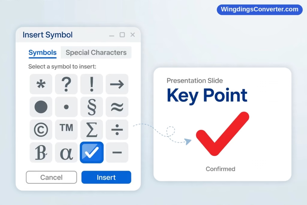
- In the Symbol dialog, set the Font dropdown to Wingdings.
- Scroll the grid and click a symbol to preview it, noting its character code if you plan to reuse it. Double-click, or click Insert, to place it on the slide, then close the dialog.
Microsoft’s own documentation on inserting symbols and special characters in Office walks through this dialog in detail, including character codes, and it’s worth bookmarking if symbol work becomes routine for you. The dialog is shared across Office, so what you learn here transfers directly to the process in our guide to how to use Wingdings in Excel as well.
The Symbol dialog also teaches you something typing can’t: the range of what’s available. Scroll the Wingdings grid once, slowly, before designing a symbol-heavy deck. People routinely build a slide around a symbol they half-remember, only to discover a better-fitting one existed two rows lower. Five minutes of browsing at the start beats retrofitting at the end.
Treating symbols as design elements: sizing, colour, and space
Here’s where PowerPoint work diverges from Word work. In a document, a Wingdings symbol is usually text-sized, sitting in a line. On a slide, symbols often are the visual content, and they need to be treated like graphics:
Size boldly, then check from a distance. A symbol that reads clearly on your 27-inch monitor may vanish on a projector across a meeting room. If a check mark is carrying meaning — “this phase is complete” — make it unmistakably large, then use Slide Show view and step back (literally, if you can) to judge it. If you have to squint, your audience has already missed it.
Colour with intent. Select a Wingdings symbol and change its font colour exactly like text. That simplicity is powerful: green checks for done, amber for in progress, red crosses for blocked — a colour language your audience learns in the first slide and reads instantly by the tenth. But pick a language and keep it. If green means “good” on slide 3, it can’t mean “go to the next section” on slide 9. Consistency is what turns decoration into communication.
Use alignment and duplication, not eyeballing. PowerPoint’s guides, Align tools (on the Shape Format / Picture Format ribbon areas when objects are selected), and good old Ctrl + D to duplicate an already-sized, already-coloured symbol will keep a row of markers perfectly even. Four hand-placed checks at slightly different sizes look careless in a way audiences feel even when they can’t name it. Duplicate the first perfect one instead.
Give symbols breathing room. Symbols jammed against text look like typos; symbols with clear space around them look like icons. If a marker sits beside a bullet point, a little extra indent or a separate text box pays off immediately. And resist filling every bullet with a symbol. White space is a design element too, and a slide where everything is highlighted is a slide where nothing is.
Animate sparingly, if at all. Yes, you can make a check mark appear with a build animation as you announce each completed item. Used once, deliberately, it focuses attention. Used on every symbol on every slide, it slows your talk down and irritates the room. Let your voice do most of the revealing; let animation underline only genuine turning points.
Practical patterns that work well on slides
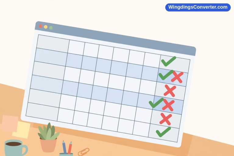
Status and checklist slides. A task list with a consistent Wingdings check beside finished items — and, importantly, an empty or different marker beside unfinished ones — reads in seconds. The honesty of the unfinished markers is what makes the checks believable.
Process and flow diagrams. Arrows between boxes are the backbone of process slides. You can draw arrows with shapes (often the better choice for long connectors), but for short, in-line direction cues — step → step → result inside a text flow — Wingdings arrows inside text boxes keep everything in one editable string.
Ratings, highlights, and callouts. A star beside the option you’re recommending, or a single large symbol as the visual anchor of a section divider slide, gives the audience a landmark. Section dividers benefit most: one big, calm symbol, a title, nothing else. After ten dense slides, that restraint feels luxurious.
Training and classroom slides. Symbols make excellent visual quiz markers and “spot this” prompts, and they’re trivially easy to duplicate across a template so every lesson deck feels like part of a set. Teachers were power users of dingbat fonts long before “icon library” was a phrase — the workflow hasn’t aged because the need hasn’t changed.
Presenting on another computer, sharing, and PDFs
Now the cautionary section, and it’s the one that saves reputations.
Your deck displays Wingdings correctly because your PowerPoint has the font. Present from a colleague’s laptop, a conference machine, or a borrowed classroom PC, and the picture can change if that machine lacks Office or the font — symbols may substitute, shift, or revert to letters. Slipping a printed agenda is embarrassing; presenting a keynote where every marker has turned into random capitals is worse.
Protect yourself with habits, not hope:
- Export a PDF backup, always. File > Save As / Export > PDF bakes the appearance in. If the live deck misbehaves on an unfamiliar machine, present the PDF full-screen and nobody will know the difference except you. Do this even when you expect to use your own laptop; PDFs also rescue you from version differences in animations and fonts generally.
- Test on the actual machine if the talk matters. Arrive early, open the deck, flip to your most symbol-heavy slide. Two minutes. If it’s wrong, switch to the PDF without drama.
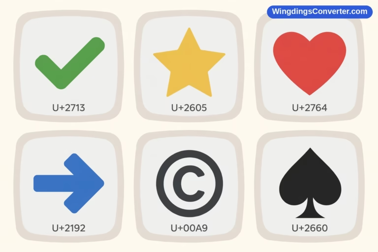
- Consider Unicode symbols for decks that will travel widely. If a deck will be opened and edited by many people on many platforms — especially if Google Slides is involved, since Slides, like Docs, doesn’t offer Wingdings — pasting true Unicode check marks, arrows, and stars is the more portable choice. They may look slightly plainer, but they look the same plainer everywhere. Our guide to how to copy and paste Wingdings symbols explains the underlying letters-versus-symbols distinction that drives this whole issue.
- Don’t paste symbols in as screenshots unless you must. They won’t scale cleanly, they bloat file size, and the next editor can’t recolour or resize them as text. Font symbols (or Unicode symbols) stay editable; pictures are a last resort for a fixed, final deck.
A note on converting decks: if you receive a Wingdings-heavy deck and need to read symbol text that has reverted to letters on your machine, copy the letters into the Wingdings converter on our homepage to decode what was meant. It’s a quick diagnostic before you assume a slide is nonsense — often it’s one font substitution away from making sense, and the historical background in the Wikipedia Wingdings article explains why these substitutions became such a shared experience in the first place.
Frequently Asked Questions
Why don’t I see Insert > Symbol in PowerPoint?
It’s usually hidden by a narrow window. The ribbon collapses groups when space is tight. Maximise PowerPoint, then look again on the Insert tab, at the right-hand end. Also make sure a text box is selected or your cursor is in text — the Symbol command is about inserting into text, so context matters.
How do I make a Wingdings symbol bigger without making all my text bigger?
Select only the symbol — click into its text box and highlight just that character — then change the font size. If the symbol is meant to stand alone as an icon, put it in its own text box from the start. Then its size, colour, position, and animation can all be controlled independently of any wording.
Will Wingdings symbols work if I present on a Mac?
If that Mac has PowerPoint for Mac (Microsoft Office), Wingdings is included and your symbols should display. If you’ll present through Keynote or Google Slides instead, test in advance — those apps don’t bundle Wingdings, so substitution is likely. A PDF export of your deck is the safest backup in any cross-platform situation.
How do I change a Wingdings symbol’s colour?
Exactly like text: select the symbol and choose a font colour from the Home tab. There’s no special “icon fill” step because, to PowerPoint, it is text. This also means theme colours apply, so your symbols can match your deck’s palette automatically if you use theme colour swatches.
Should I use Wingdings symbols or PowerPoint’s built-in icons and shapes?
They solve different jobs. Built-in icons and shapes are resizable vector graphics — best for large, prominent visuals and connectors. Wingdings symbols are text — best for in-line markers, checklists, and anything you want to type, duplicate, and restyle quickly alongside words. Many good decks use both: shapes for the diagram, Wingdings or Unicode symbols for the markers inside it.
My symbols turned into letters when a colleague opened the deck. Can I fix it permanently?
The deck itself stores letters plus Wingdings formatting; your colleague’s setup couldn’t apply the font. For a deck that must survive any machine, replace key Wingdings symbols with Unicode equivalents, or distribute a PDF alongside the editable file. Keep the Wingdings version as your master if you present it yourself on Office machines.
Conclusion
Wingdings in PowerPoint works best when you treat its symbols as what they are on a slide: design elements with a job to do. Insert them by typing if you know your set, or through Insert > Symbol when you’re exploring; size them for the back of the room, colour them with a consistent meaning, and duplicate rather than eyeball. Then protect the result — test on the presenting machine and keep a PDF at your side. Do that, and your symbols will do the quiet, useful work good slides need: saying more, with less, at a glance.