How to Use Wingdings in Microsoft Word
Wingdings has been sitting inside Microsoft Word for so long that many people assume it’s part of Word itself. It isn’t, quite — it’s a font that comes bundled with Windows and Office — but for practical purposes, if you have Word, you have Wingdings, and you can start decorating documents with check marks, arrows, little envelopes, pointing hands, and dozens of other symbols in about ten seconds.
This guide covers how to use Wingdings in Microsoft Word as a whole: where the font lives, how to apply it, how to make its symbols bigger, smaller, and coloured like any other text, and — just as important — the saving and sharing pitfalls that catch people out when a document leaves their computer. If what you need is the fine detail of inserting symbols one by one, character codes, and keyboard tricks, that’s the companion guide on how to type Wingdings symbols in Word, and we’ll point to it where it fits.

What Wingdings actually is, in 30 seconds
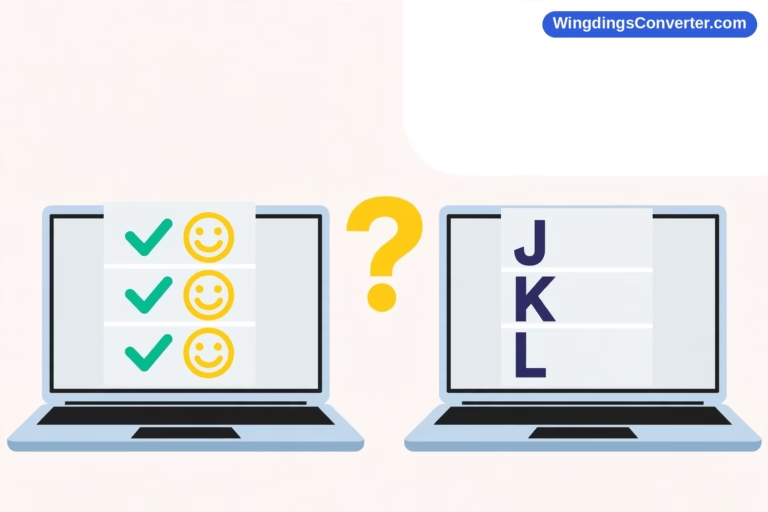
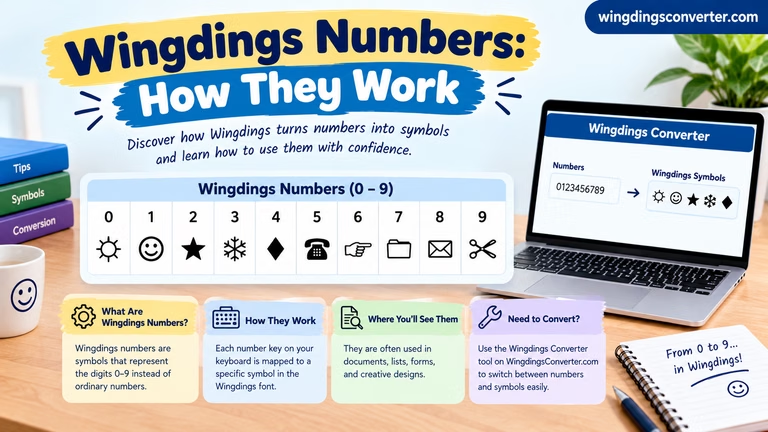
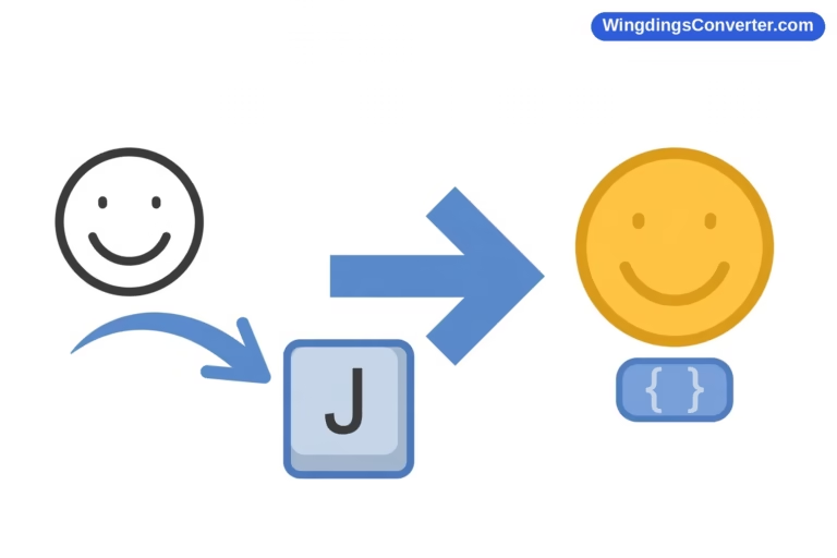
Wingdings was released by Microsoft in 1990, designed by Charles Bigelow and Kris Holmes of Type Solutions. It’s a dingbat font: instead of letter shapes, its slots contain pictures. When text is formatted in Wingdings, typing ordinary letters produces symbols instead — J gives you a smiling face, L a sad face, and so on.
Keep that mechanism in mind, because everything in this guide — the sizing, the colouring, the sharing warnings — follows from it. A Wingdings symbol in Word is still, underneath, an ordinary character wearing the Wingdings font. Word treats it as text, not as a picture. That’s what makes it so easy to format, and also what makes it fragile when the font goes missing on someone else’s machine.
Step 1: Apply the Wingdings font to text
The simplest way to use Wingdings in Word is the type-and-convert approach:
- Type the character whose symbol you want, in your normal font. For a first experiment, type a capital J.
- Select that character — double-click won’t always isolate a single character, so click just before it and Shift+Right Arrow, or drag across it.
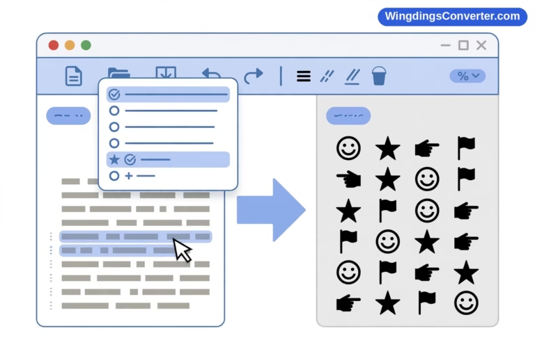
- Open the font dropdown in the Home tab (or press Ctrl+Shift+F for the Font dialog) and choose Wingdings.
- The letter is replaced on screen by its Wingdings picture — in this case, a smiling face.
To write a run of symbols, it’s easier to switch first and type second: place your cursor where you want the symbols, set the font to Wingdings, and type. Every keystroke lands as a picture. When you’re done, switch the font back to your body font before you carry on typing, or your next sentence will come out as an unreadable strip of icons — a rite of passage every Wingdings user goes through exactly once.
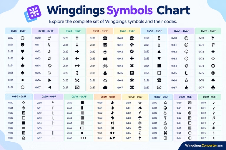
Worth knowing: there are actually three fonts in the family. Wingdings is the original and the most varied. Wingdings 2 leans towards office and document symbols, and Wingdings 3 is mostly arrows and triangles in different styles. They are separate fonts with separate symbol sets, so a character that shows a star in one may show something entirely different in another. And don’t confuse them with Webdings, Microsoft’s later symbol font from 1997 — Wingdings vs Webdings explains how those two differ.
Step 2: Size, colour, and style your symbols
Because Wingdings glyphs are text, all the usual formatting works:
- Size: Change the font size as normal. A check mark at 12pt is a discreet tick; at 36pt it’s a headline feature. Symbols scale cleanly to large sizes because they’re vector shapes, not images, so they won’t go fuzzy.
- Colour: Use the Font Color button like any text. A green check or a red cross is a perfectly good visual shorthand — just don’t rely on colour alone to carry meaning if the document might be printed in black and white.
- Bold: Applying bold thickens most Wingdings glyphs noticeably. It’s a quick way to make a symbol stand out in a checklist without increasing its size.
- Highlighting and effects: Text highlight, borders, and shading all apply too, which is handy for things like warning symbols you actually want people to notice.
One practical tip: if you’re building something like a checklist or a ratings row (five stars, say), put the symbols in their own paragraph or table cell with centred alignment. Trying to wrangle them inline with body text — different size, different baseline — gets fiddly fast.
Step 3: Use Wingdings for bullets and repeated elements
Where Wingdings genuinely earns its keep in Word is in repeated decorations:
Custom bullet points. Select a list, open the Bullets dropdown, choose “Define New Bullet,” then “Symbol,” and set the font to Wingdings. Now every item in your list gets the same symbol — a pointing hand, a small star, a box-outline you can tick by hand when printed. It gives printed worksheets and sign-up sheets a finished look with almost no effort.
Simple icons inline. Need a phone symbol next to a contact number, or an envelope next to an email address on a CV or flyer? One or two Wingdings glyphs, sized a touch larger than the text, do the job neatly without inserting image files that bloat the document and refuse to align.
Borders and dividers. A row of the same small symbol, centred, makes a decent section divider in informal documents. Keep it short — a divider is seasoning, not a main course.
What Wingdings is not good for: long passages (it’s not text anyone can read), anything that must be searchable or accessible to screen readers, and anything heading to people outside the Windows/Office world. More on that next.
Saving your document: formats matter
Here’s where people get caught out, and it’s worth understanding rather than just memorising rules.
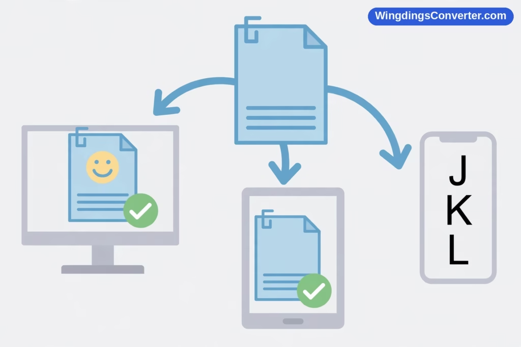
DOCX (the default Word format). Your file stores the characters plus the instruction “show this in Wingdings.” On another Windows PC with Office, it will look right. On a Mac, it generally looks right inside Word, because Office for Mac includes Wingdings too. Outside Office — a phone, a web preview, a different editor — all bets are off; the recipient may see plain letters where your symbols were. We explain the full mechanics in why Wingdings looks different on different devices.
PDF. Exporting to PDF from Word embeds the font information, freezing the appearance. This is the safest way to share the look of a Wingdings document. The catch: anyone copying text out of that PDF gets the underlying letters back, and search engines reading it see letters too.
Plain text (.txt) or pasting into other apps. Fonts don’t survive this at all. Your symbols revert to the letters you typed. If you ever need the content of a Wingdings passage as readable text, run it through a translator — our homepage Wingdings converter turns Wingdings back into normal text and vice versa. The history and background of the font itself is covered on Wikipedia’s Wingdings page if you’re curious.
Sharing checklists: a two-minute safety routine
Before you send a Wingdings-heavy document anywhere important, do this:
- Save a PDF copy and send that alongside (or instead of) the DOCX if the appearance matters.
- Open the file on your phone. Ten seconds. If the symbols are letters there, they’ll be letters for your recipients too.
- Consider Unicode replacements for the key symbols. An actual ✓ check mark (U+2713), ★ star (U+2605), or ♥ are real characters that display on virtually every device. For a title or a finished checklist that must work everywhere, swapping the handful of critical symbols is worth it. How to convert Wingdings to Unicode walks through it.
None of this means “don’t use Wingdings.” It means use it where it’s strong — quick, good-looking symbols inside Office documents and anything destined for print from your own machine — and don’t lean on it where it’s weak.
Finding the symbol you want
Typing letters blind and hoping the right picture appears is nobody’s idea of fun. In practice you have three better options, all covered in detail in the companion and finder guides:
- The Insert > Symbol dialog, where you can browse the whole Wingdings set visually and insert with a double-click — the typing mechanics are in how to type Wingdings symbols in Word.
- A dedicated hunt through the set with previews, covered in how to find Wingdings symbols in Word.
- If the document will be shared widely, skipping Wingdings and inserting the equivalent Unicode symbol instead (Insert > Symbol with a normal font selected) — slightly less charming, vastly more portable.
Microsoft’s own documentation on inserting symbols and special characters is the authoritative reference for the dialog itself.
Frequently asked questions
Is Wingdings included with every version of Word?
Effectively yes, on Windows — it has shipped with Windows and Office for decades, including current Microsoft 365 versions. Word for Mac also includes it as part of Office. If you somehow don’t have it, see our guide on how to install the Wingdings font on Windows, and help for downloading it is on the Wingdings font download page.
Why did my whole sentence turn into symbols?
Because the font was still set to Wingdings when you kept typing. Select the symbol-covered text and change its font back to your normal body font — the letters reappear, completely unharmed. Nothing was converted or lost; only the display font changed.
Can I make Wingdings symbols bigger without affecting my text?
Yes. Select just the symbols and raise their font size — they’re characters, so they resize independently. For a row of symbols you adjust often, putting them in their own paragraph or table cell makes repeated formatting much easier.
Will my Wingdings document look right on someone else’s computer?
On another Windows PC with Office: yes. On a Mac with Office: almost always. On phones, web previews, or non-Microsoft editors: often not — the symbols may appear as plain letters or boxes because those systems may not have the font. For important shares, send a PDF as well, or swap critical symbols for Unicode equivalents.
What’s the difference between Wingdings, Wingdings 2, and Wingdings 3?
They’re three separate fonts with three different symbol sets. Wingdings is the broad original; Wingdings 2 focuses more on office/document glyphs; Wingdings 3 is largely arrows and pointers. The same typed letter produces a different picture in each, so always check which one a document is using before editing it.
Are Wingdings symbols accessible to screen readers?
Poorly, in most cases. A screen reader reads the underlying character — so a check mark inserted as the Wingdings ü may be announced as a letter or skipped — which can make symbol-only communication meaningless. In documents that need to be accessible, pair important symbols with real words, or use genuine Unicode symbols that assistive technology can name.
Conclusion
Using Wingdings in Microsoft Word is simple once you remember what it is: a picture font applied to ordinary characters. Apply it from the font dropdown, format its symbols exactly like text — size, colour, bold — and put it to work on bullets, checklists, and quick inline icons where it shines. Then respect its one weakness: the pictures only exist where the font does. Save and share accordingly, reach for PDF or Unicode symbols when a document travels, and Wingdings will be the handy little toolkit it was designed to be back in 1990.