Why Does Wingdings Look Different on Different Devices?
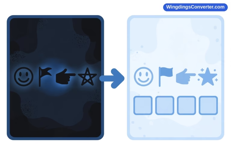
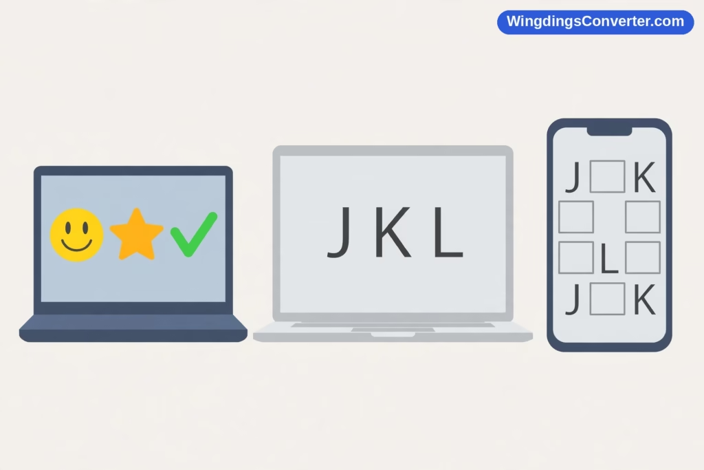
Here’s a scenario that has confused a lot of people. You make a document on your Windows laptop — a cheerful row of Wingdings symbols down the side, maybe a check mark here, a little phone icon there. It looks great. You email it to a colleague. They open it on their Mac, or their phone, and reply: “I think your file is broken. It’s just random letters.” Or worse, it’s a row of empty boxes. Nothing you typed changed. The file is identical. So why does Wingdings look different on different devices — sometimes completely different, to the point of being unreadable?
The answer sits in how Wingdings works under the hood, and honestly, once you get it, you’ll also understand why so many modern tools quietly steer you away from it. Let’s take the causes one at a time.
The core issue: Wingdings is a costume, not a character
Everything in this article follows from one fact, so let’s put it up front.
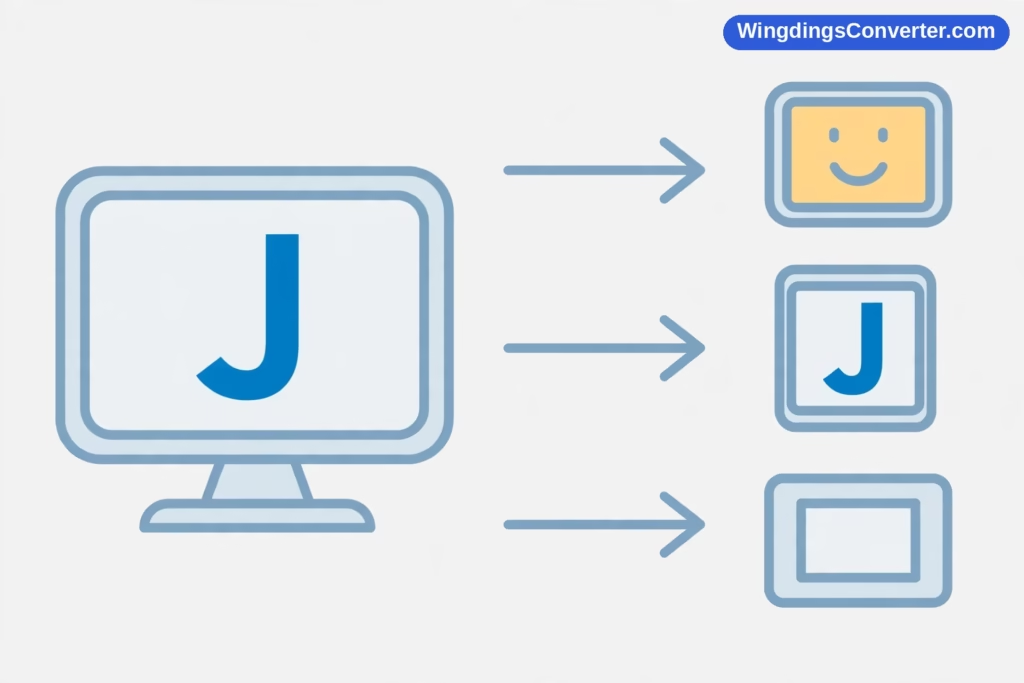
Wingdings, released by Microsoft in 1990 and designed by Charles Bigelow and Kris Holmes of Type Solutions, is a font — a set of pictures. It does not contain real symbol characters. Instead, it borrows the slots of ordinary keyboard characters and draws a picture in each slot. Type the letter J and Wingdings draws a smiling face. Type K and you get a neutral face, L gets you a sad face. The famous Wingdings check mark sits in the slot for ü, character code 252.
Underneath, in the actual file, there is no smiley and no check mark. There is a letter J and a character ü, plus a note saying “display these in the Wingdings font.”
Compare that with a genuine Unicode symbol. A true check mark, ✓, has its own code point — U+2713. The file itself records “this is a check mark,” and any font that has a check mark can draw it, each in its own style. The identity travels with the text.
Wingdings identities do not travel. Only the letter and the font request travel. If the receiving device honours the font request, you see pictures. If it can’t — for any of the reasons below — you see whatever that device does with a bare letter J wearing no costume. That’s the whole mystery, and the rest is detail.
If you want the deeper comparison, Wingdings vs Unicode lays the two systems side by side.
Cause 1: The device doesn’t have Wingdings installed
This is the big one. Wingdings feels universal if you live in the Windows world, because it has shipped with Windows and Microsoft Office for decades. But that bundling is a Microsoft ecosystem thing, not a law of computing.
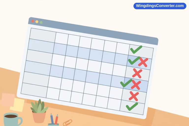
- Windows PCs: Wingdings is essentially always present. Your document will look as intended.
- Macs: Here’s the nuance people get wrong. If the Mac has Microsoft Office installed, Word for Mac brings Wingdings along, and documents usually render correctly inside Word. But step outside Office — open the text in a built-in Mac app, a web page, or a different editor — and Wingdings may not be there at all, because it isn’t a standard macOS system font in the way it is on Windows.
- iPhones and iPads: Wingdings is not a standard font. Some apps bundle their own fonts or download them; many don’t. Expect letters or boxes.
- Android phones: Same story. No system Wingdings. Whether your symbols survive depends entirely on the app you’re viewing in.
- Linux: Not included by default either, though some users install Microsoft core fonts manually.
So the single biggest variable is simply: does this particular device, in this particular app, have a font named Wingdings available? If not, the costume is missing from the wardrobe, and every symbol in your document is exposed as the ordinary letter it always was.
That’s also why the same phone can show a Wingdings document correctly in one app and as gibberish letters in another. The app that bundles or can access the font shows pictures; the one that can’t, can’t.
Cause 2: Font substitution — the device improvises
Devices rarely give up without trying. When a requested font is missing, the system performs font substitution: it picks a replacement font and uses that instead. Sensible enough for ordinary text — swapping one serif for another keeps a document readable. For Wingdings, substitution is a disaster, because the substitute font draws what the characters actually are.
Your smiley J becomes… a J. In whatever typeface the system chose. From the reader’s perspective, your carefully decorated checklist has turned into a column of stray capitals, which is why people assume the file is corrupted or encoded wrongly. It isn’t. It’s being displayed with perfect accuracy — just without the one font that made it mean something.
Sometimes substitution produces boxes instead of letters, particularly when the replacement mechanism targets the character codes used by symbol fonts and finds no glyph there at all. Whether you get letters or boxes depends on the platform and app, which is itself part of why the results feel so inconsistent. Our article on why Wingdings shows as squares digs into that variant specifically.
Cause 3: The app re-interprets the text when you copy, paste, or upload
Even on a device with Wingdings, moving text around can strip the illusion.
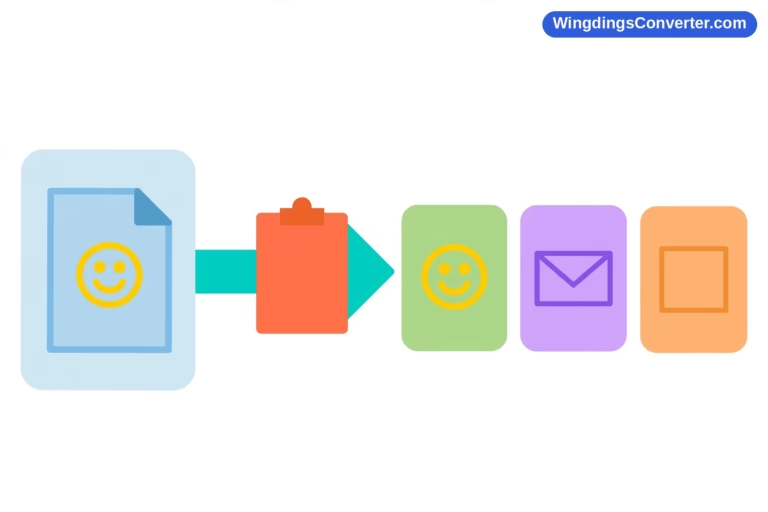
Copy a line of Wingdings from Word and paste it into a website form, a messaging app, or a plain-text editor, and one of two things usually happens. Either the formatting is dropped and you’re left with the raw letters, or the app converts fonts in a way that changes the characters. Email is a notorious middle ground: your mail program may render your message with Wingdings, but your recipient’s mail service — especially a webmail page that sanitises fonts for security or simplicity — may not.
Web pages add another twist. A site can provide a web font, a font file the browser downloads for that page. Almost no site does this for Wingdings, so Wingdings text pasted into the web generally falls back to the browser’s default behaviour: letters, or boxes. And when someone copies text from a Wingdings-styled page and pastes it elsewhere, the plain letters are what travel. This copy-paste fragility is common enough that we gave it its own article: why Wingdings symbols change when copied.
Cause 4: Version and sibling differences — Wingdings is not one font
Even in the friendliest case — Windows at both ends — small differences creep in.
There isn’t just one Wingdings. Microsoft also made Wingdings 2 and Wingdings 3, which are separate fonts with their own, different symbol sets, plus the related Webdings (released in 1997) with yet another set. A document using Wingdings 2 opened on a machine that substitutes plain Wingdings — or vice versa — can show wrong symbols rather than no symbols, which is arguably worse: nobody realises anything is off.
Add to that the small rendering differences between Office versions and operating system releases — a glyph drawn slightly differently, an app that handles the font’s legacy encoding more or less faithfully — and “looks different” can mean anything from subtly restyled to totally replaced. The underlying cause remains the same family: everything depends on exactly which fonts are present and how the software treats them.
Cause 5: The printer (or PDF) has its own ideas
A document can survive the journey to another screen and still fall at the final hurdle. Some printers substitute their own internal fonts. Some PDF exports embed fonts properly; others assume the reader’s system will provide them — a safe assumption for Arial, a risky one for Wingdings if the PDF is then opened on a phone.
If your symbols matter, export the PDF from the same machine that created the document, make sure font embedding is on, and open the PDF once on a different device to check. It takes thirty seconds and saves the strange phone call later.
So how do you make symbols that look the same everywhere?
You have a few options, depending on how much the document matters:
For documents staying inside your own Windows/Office world, Wingdings is honestly fine. Everyone has the font; the symbols will show.
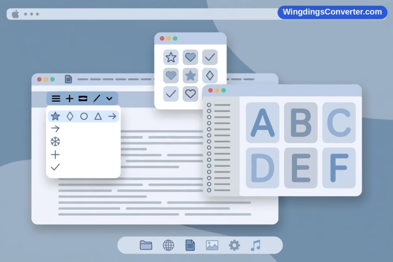
For anything that will travel — emailed, uploaded, opened on phones — replace Wingdings pictures with real Unicode symbols. A genuine ✓ (U+2713), ★ (U+2605), or → will render on effectively every modern device, drawn by whatever local font is available but always a check mark, a star, an arrow. If your source material is already in Wingdings, you can decode Wingdings online to recover the underlying text, then rebuild the symbols properly. The Wingdings converter on our homepage handles that translation in both directions.
For a finished, fixed layout — a poster, a worksheet, a handout — send a PDF with embedded fonts, or even turn the symbol-heavy parts into images. Neither is elegant for editable text, but both freeze the appearance exactly as you designed it.
And a special warning for passwords, filenames, and form fields: never rely on Wingdings there. Those contexts strip fonts entirely. Whatever you typed will be stored as the plain letter, full stop.
Frequently asked questions
Why does Wingdings look fine on my computer but like letters on my phone?
Because your computer has Wingdings and your phone almost certainly doesn’t. Wingdings ships with Windows and Office, but it isn’t a standard font on iOS or Android. Without the font, the phone displays the underlying characters — which are ordinary letters, since Wingdings works by drawing pictures over letter codes.
Does Wingdings work on a Mac?
Inside Microsoft Word for Mac, usually yes — Office includes the font. Outside Office apps, it’s unreliable. A Mac without Office, or the same text opened in a non-Microsoft app, may show letters or boxes instead. Our guide on how to use Wingdings on Mac explains the workarounds, including converting to Unicode symbols that display everywhere.
Why do some symbols show as boxes instead of letters on other devices?
It depends on how the receiving app substitutes the missing font. Some show the underlying letter in a default font; others look up the symbol-font character code in a font that has no glyph at that position and display the empty “not defined” box. Same root cause — Wingdings is missing — two different failure styles. Why symbols show as boxes explains the box mechanism in detail.
If I embed the font or send a PDF, will Wingdings look identical everywhere?
A properly made PDF with embedded fonts comes very close — that’s the most reliable way to share a Wingdings document’s appearance. Just verify the PDF on a second device before sending it widely, and remember that if anyone extracts or copies the text out of that PDF, they’ll get the underlying letters again.
Are Wingdings 2 and Wingdings 3 interchangeable with Wingdings?
No. They are separate fonts with different symbol assignments. Text formatted in Wingdings 2 displayed in Wingdings (or vice versa) will show incorrect symbols — not the intended pictures, and not obviously wrong enough to warn the reader. Always check which of the family a document actually uses.
What’s the safest alternative to Wingdings for shared documents?
Real Unicode symbols. Characters like ✓, ★, ♥, and → have their own code points, so their identity is stored in the text itself rather than borrowed from a font. Every modern platform ships with fonts covering the common ones. For the full method, see how to convert Wingdings to Unicode.
Conclusion
Wingdings looks different on different devices for one reason with many faces: its symbols live in a font, not in the text. Where that font is present — Windows, Office — you see pictures. Where it’s absent, substituted, or stripped away by an app, the letters underneath show through, or the glyph lookup fails and you get boxes. The file never changed; the wardrobe did. Keep Wingdings for work that stays on your own machine, convert to genuine Unicode symbols for anything that travels, and this particular mystery will never bother you again.